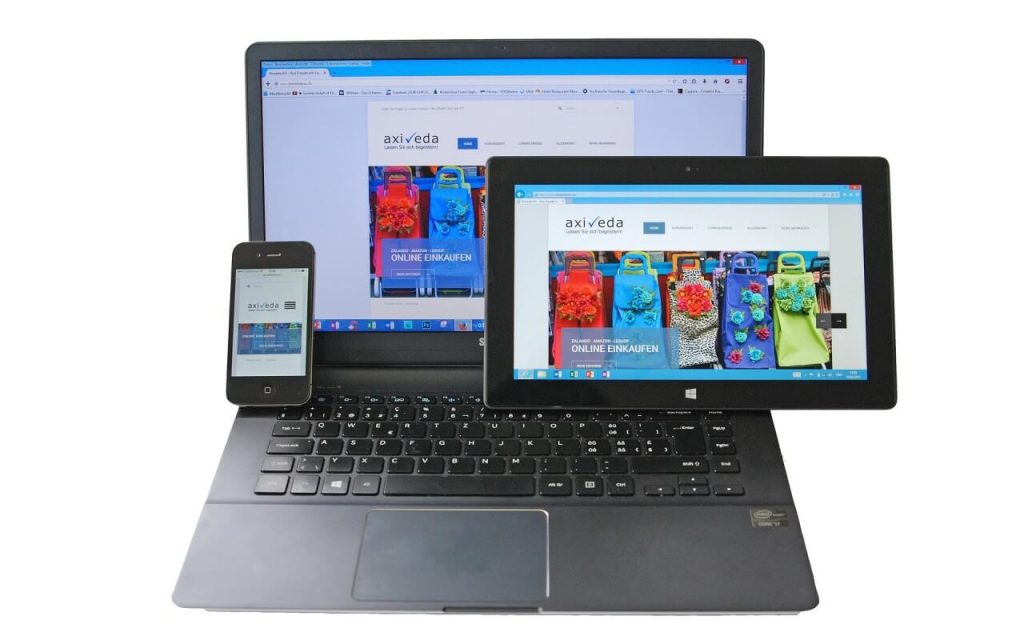
In today’s digital age, having a mobile-friendly website is no longer a luxury—it’s a necessity. With the majority of internet users accessing websites through their smartphones, it’s crucial for small businesses to ensure their online presence is optimized for mobile devices. A mobile-friendly website can significantly increase your small business sales, improve customer satisfaction, and enhance your brand’s reputation. In this article, we’ll explore the importance of mobile optimisation and how it can boost your business’s bottom line.
Why Mobile-Friendliness Matters
- Growing Mobile Usage
Recent statistics show that more than half of all global web traffic comes from mobile devices. People are using their smartphones and tablets to browse the internet, shop online, and search for local businesses more than ever before. If your website isn’t mobile-friendly, you risk alienating a large portion of potential customers who might find it difficult to navigate your site on a smaller screen. - Improved User Experience
A mobile-friendly website provides a seamless experience for users, no matter what device they’re using. Mobile optimization ensures that your website adjusts to different screen sizes, making it easy for visitors to read content, view images, and navigate your site. A positive user experience leads to higher engagement rates, longer time spent on your site, and a greater likelihood of conversions. - Better Search Engine Rankings
Search engines like Google prioritize mobile-friendly websites in their search results. This means that if your website isn’t optimized for mobile, it may not rank as high as your competitors’ sites, making it harder for potential customers to find you. Improving your mobile compatibility can enhance your search engine visibility, driving more organic traffic to your site. - Higher Conversion Rates
Mobile-friendly websites are more likely to convert visitors into customers. A study by Google found that 61% of users are unlikely to return to a mobile site they had trouble accessing, and 40% will visit a competitor’s site instead. By ensuring your site is easy to use on mobile devices, you increase the chances of converting visitors into paying customers.
Recent statistics show that more than half of all global web traffic comes from mobile devices. People are using their smartphones and tablets to browse the internet, shop online, and search for local businesses more than ever before
How Mobile-Friendly Design Boosts Sales
Simplified Navigation and Accessibility
Mobile-friendly websites are designed with simplified navigation, making it easy for users to find what they’re looking for without frustration. Key information such as product descriptions, contact details, and call-to-action buttons are prominently displayed and easily accessible. This ease of use encourages visitors to take action, whether it’s making a purchase, signing up for a newsletter, or contacting your business.

Faster Loading Times
Speed is a crucial factor in user experience. Mobile-friendly websites are typically optimized for faster loading times, which is vital because users expect pages to load quickly on their mobile devices. Studies show that a delay of just one second in page loading time can lead to a 7% reduction in conversions. A fast-loading website keeps users engaged and reduces the likelihood of them abandoning your site before making a purchase.
Enhanced Local Search Results
Many mobile users perform location-based searches, such as looking for nearby restaurants, shops, or services. A mobile-friendly website increases your chances of appearing in local search results and being featured in Google’s Local Pack, which highlights top local businesses. This can drive more foot traffic to your physical location and boost online sales from local customers.
Effective Mobile Marketing Strategies
Having a mobile-friendly website allows you to implement effective mobile marketing strategies, such as SMS marketing, push notifications, and mobile ads. These strategies can target customers directly on their mobile devices, promoting special offers, discounts, and new products. A well-designed mobile site ensures that these marketing efforts lead to a seamless and engaging shopping experience.
Tips for Making Your Website Mobile-Friendly
Use a Responsive Design
Responsive design automatically adjusts your website’s layout based on the user’s device. This ensures that your content looks great and functions properly on all screen sizes, from desktops to smartphones. Most modern website platforms and themes come with built-in responsive design features.
Optimize Images and Media
Large images and media files can slow down your website’s loading speed. Optimize these elements by compressing them without losing quality and using formats that load quickly on mobile devices. This will help improve your site’s performance and user experience.
Simplify Navigation
Mobile users prefer simple, straightforward navigation. Use a clear and concise menu with easily clickable buttons. Consider using a hamburger menu (three-line icon) to save space and keep the layout clean and organized.
Prioritize Content
Mobile screens are smaller, so prioritize the most important content. Place essential information and calls-to-action (CTAs) above the fold, where users can see it without scrolling. Keep text concise and use bullet points to make content easy to read.
Test Your Website on Multiple Devices
Regularly test your website on various mobile devices and screen sizes to ensure it performs well across all platforms. Use tools like Google’s Mobile-Friendly Test to identify and fix any issues that may arise.
Conclusion
In today’s mobile-first world, having a mobile-friendly website is essential for small businesses looking to increase their sales and stay competitive. By providing a positive user experience, improving search engine rankings, and leveraging mobile marketing strategies, you can attract more customers and boost your bottom line. If your current website isn’t mobile-friendly, consider investing in a redesign or working with a professional web designer to optimize your site for mobile devices. Your business’s success may depend on it.